01. The Goal
Create a modern, user friendly, and responsive website and portal that would educate financial professionals about our client’s business and allow them to manage their clients and book of business.
The problem: Agents using the portal took a long time to learn how to use it and often complained about the poor user experience.
The team: Project Manager, UX Manager, UX Designer (me!), Creative Director, Visual Designer
The tools I used: Visio, Sketch, Zeplin, Aha!, Chalkmark
The deliverables: Business requirements document, sitemaps, content audit, template/design system library, mobile and desktop wireframes, prototype, usability study results
Discovery
Research for this portion of the Annuity website was difficult because we didn’t have access to competitor’s portals to be able to know what they were doing. Instead, we worked with the stakeholders through a workshop to better understand how their portal worked and any pain points their users were experiencing. For the financial professionals website, we were able to do a competitor analysis to determine how best to bring our client’s website in line with the industry standard. Following these activities, we wrote a business requirements document that outlined all the major features we should include, analyzed their information architecture and proposed a new sitemap that helped simplify their navigation across both the website and the portal.
02. Desktop Experience
The visual designs were built directly from the Sketch file I used for the wireframes, which means there was only very small tweaks done by the visual designer, and he was able to ramp up on the production quickly by using the wireframe files.


03. Mobile Solutions
It was important to the client to have a modern, responsive website. For this reason, I designed with a “mobile-first” approach that allowed me to pay special attention to the considerations for mobile, especially hierarchy of information. I also found that it helped hone the information architecture of the site.


04. The Process
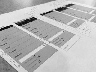
The site architecture for the portal was a key part of this project because the abundance of features accessed from the portal meant a lot complexity in the portal, which we wanted to improve. We went through many iterations of the site map in order to work through this piece before moving on to the wireframes. The most important page of the portal project was the dashboard – the existing solution had a dashboard that didn’t necessarily help the users achieve their goals. We worked with the client to reimagine the dashboard with new features that would help financial professionals immediately find information that was relevant to them on the first page.
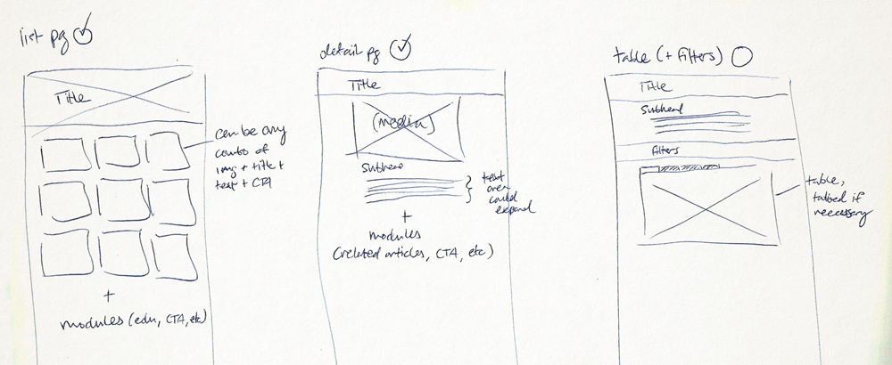
For the remaining pages, we used a content audit of the existing site to understand how best to wireframe pages into specific templates. We carefully considered the content for relevancy and hierarchy on the page using a mobile-first approach. By understanding the types of content we needed to use through a content audit, we were able to design on a pattern or component level, which allowed for the creation of reusable elements that could be combined in a multitude of ways to create templates. This greatly aided in an efficient handover to the client’s development team at the completion of the project and allowed the client to scale the project as needed once we handed over the work.


05. Final
Once the wireframes had been signed off, they were given to the visual designer to skin. A few weeks later, I was able to take the final visual designs to create an unmoderated quantitative first-click test in Chalkmark. After writing a test plan, in which we outlined the goal of the usability study, the criteria for the users, the tasks they would complete, and the pre- and post-test questions, we built the study in Chalkmark and ran it for about two weeks. We ended up with just under 100 participants, and received a lot of valuable feedback. Presenting those insights back to client, we were able to decide which changes to the design should be implemented – they all ended up being minor but important tweaks that greatly enhanced the experience. We look forward to seeing this portal built so that the agents can more easily manage their clients and book of business!
Usability test – Task result page
For this usability test, we had both a pre- and post- test questionnaire, and set tasks for users to complete in an unmoderated first-click test. We provided screenshots of the new versions of pages, and asked where users might go to find specific information. The data gathered came back in a heatmap type format, where we could see the “correct” and “incorrect” areas that our users were clicking. We received some great feedback on this usability test!
Usability test – Questionnaire result page
Because we were able to test this redesign with existing users that had experience with the original version, we were able to conduct our usability test from a comparison standpoint – working to obtain data to verify if the redesign was indeed an improvement over the existing version.